
We promised you pie charts: Visualizing Ohio State's offense-defense balance since 2014
Doug and Bill talked about this on the latest Substack show.

COLUMBUS — When you talk about pie charts, you must deliver pie charts.
Using a scientific website originally intended, I believe, to help preschoolers categorize their stuffed animals, I made these pie charts.
If you have not listened to our Wednesday show on the balance of the Ohio State offense and defense over the last 12 years, and you want to be surprised, DO NOT LOOK AT THESE CHARTS.
If you have taken that show in, or if you are curious about the breakdowns and will get to the discussions later, then here you are.
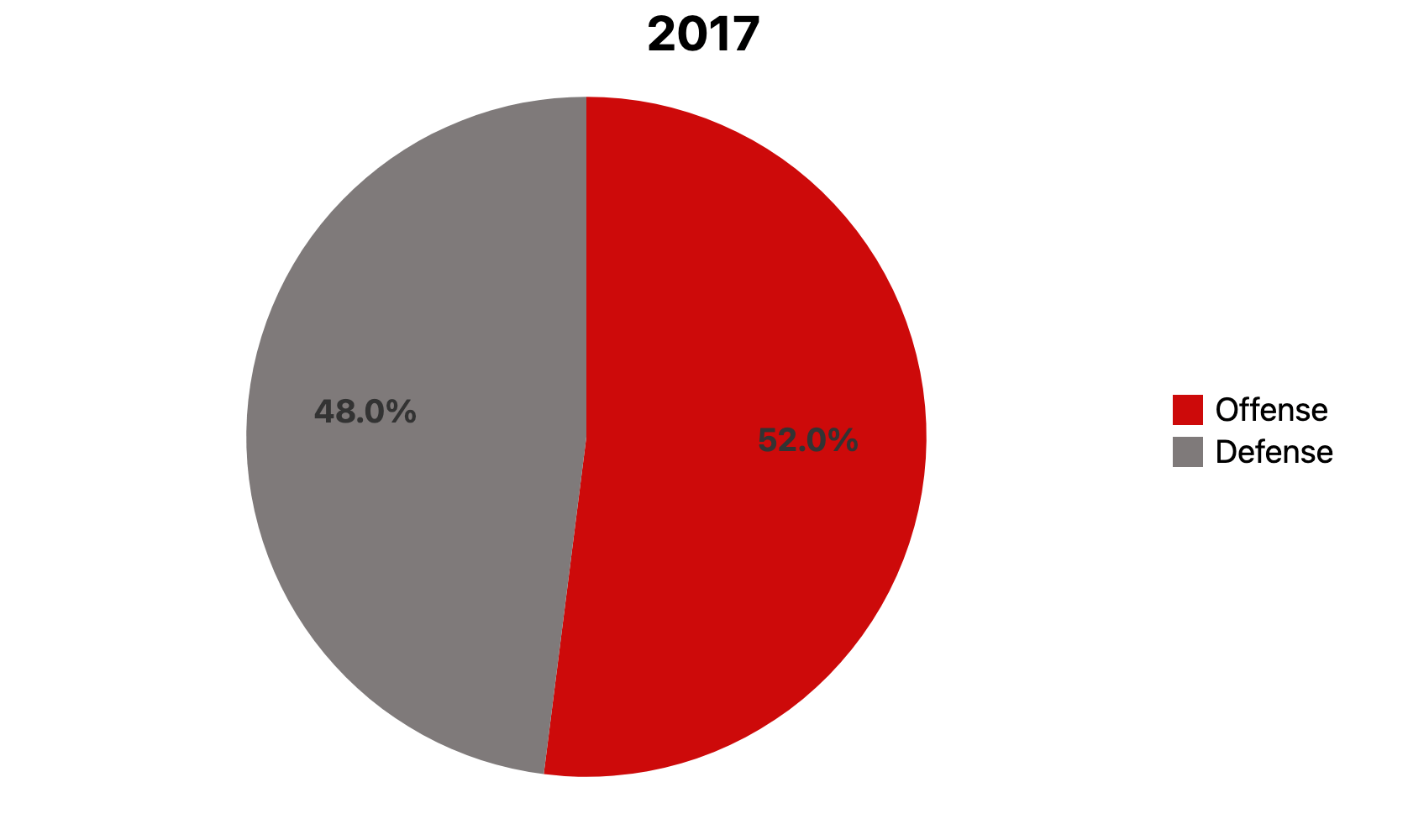
The idea was deciding how much each side of the ball contributed to Ohio State’s success since 2014. Over 12 years, we decided the OSU defense had the edge for six years and the offense had the edge for six years.
Also, overall for these 12 years, the breakdown would be 54 percent offense, 46 percent defense.
And now … pie charts.
Keep reading with a 7-day free trial
Subscribe to The Bill and Doug Show: Premium Ohio State Writing & Talk to keep reading this post and get 7 days of free access to the full post archives.